Despite how much I care about and base daily living decisions on thoughts about my climate impact, I realized that I have never once actually sat down and tabulated a detailed estimate of my carbon footprint. So I did.
The general results of the calculation was not surprising, but the sheer size of the contribution from travel shocked me. On the plus side though, it was also personally validating to see how some decisions I have made and stuck to are actually making a difference!
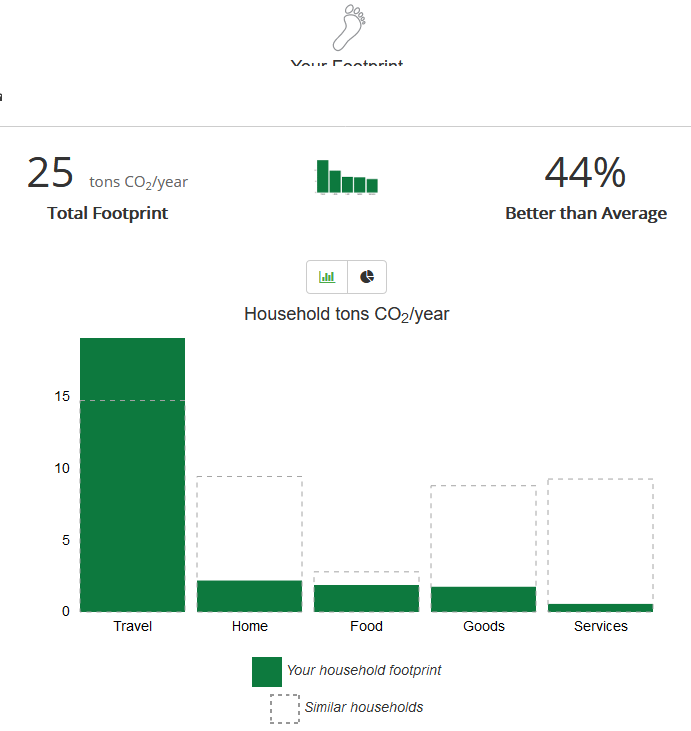
Below is my estimated annual footprint, using the free carbon footprint calculator from the Nature Conservancy.
So I mean, you know, if I’m looking for a category in which I could make some improvement… just gotta somehow find one of these that stands out in some way I guess…
The details of my tabulation are below.
Step 1: Establish a Reference. The calculator asks for basic demographic information, including my zipcode (Hampton Roads area, Virginia), the number of people in my household (1), and my gross annual income (I’m a public employee… find me if you can!). These factors provide the statistical baseline for “normal” when comparing to “similar households”.
Step 2a: Transportation – Car. Since I don’t keep track year by year, I estimated my yearly car mileage by taking the total miles on my car (38,000) and dividing by the 3.5 years I’ve owned it to get about 10,850 miles per year. I drive a 2017 Toyota Camry Hybrid, which averages about 40 mpg overall. Note: I did not account for car travel due to work (say to DC or Wallops Island), since in most of these cases I’m given a rental car and I don’t keep track of that mileage, plus some of it is carpooled. I suppose I could ballpark that given known trips I took, but it’s honestly probably in the wash given my air travel…. speaking of which…
Step 2b: Transportation – Air Travel. Ouch. Here’s the category that really hit me! I used 2019 as the year for estimating, since I think it is more “typical” than 2020 for my air travel due to Covid. Since I didn’t have exact mileage, I estimated round-trip flight distances between origin/destination city pairs using an online tool, and then doubled it to account for the return leg. Note that this likely underestimates the total value by a decent amounbt… it doesn’t account for layovers/stops, rerouted flights, or cases where a flight loiters in a holding pattern at a busy airport or flies around weather, etc.
The above chart accounts for both personal and work air travel – a whopping 34,534 annual miles, generating 15 tons of CO2 emissions per year (about 60% of my total footprint). If I were to subtract out work travel (4 domestic trips), my personal air travel by itself (5 domestic trips and 1 international trip) was 21,368 miles, or roughly 6 tons/yr less than my total work + personal. (That alone would improve my relative score to 58% better than average for my income bracket + zip code.)
Step 3: Home Energy Use. I live in a 960 sqft apartment by myself. For the past 12 months (11/4/2019 – 11/2/2020) my energy bills show a total of 5665 kWh used. The calculator includes a slider for how much of your home energy use you offset, which helps me get that nice low result in this category: I offset 100% of my electricity usage through Dominion Energy’s voluntary Green Power program. (Note that customers can select a block option, so it doesn’t have to be all or nothing.) I should note that I don’t think that applying this offset to carbon-footprint directly is totally accurate, as Dominion’s website claims it sources the equivalent of my energy usage from “renewable sources” — which does not necessarily mean carbon-neutral sources. However, I think it’s safe to assume that this certainly a lot better than no offset at all.
Step 4: Nutrition. The “advanced” mode of the calculator allows you to dial in the average number of calories per day you consume from various sources. Thanks to my penchant for tracking my nutrition data on MyPlate over the last year as I simultaneously ramped up running training plans and shifted to a more plant-based diet, I have four separate week-long snapshots of everything I ate during those weeks, at different times of the year. Averaging those shows that the overall effect of a mostly-plant-based diet (I still eat fish and dairy) puts me at about a third below the average carbon footprint for Food.
Step 5: Shopping. This one seemed the most vague of the categories for me, since it basically consists just of two sliders, one each for “Goods” and “Services”, that represent the average dollar amount you spend on each category per month. I wish there were a way to differentiate between locally-sourced or used/up-cycled goods versus new goods shipped from afar; further, the estimate doesn’t differentiate between actually recyclable goods and Horrible Planet Death Plastic of Deception. But, that’s okay, it’s just a model I suppose! It does feel good to see how much below average my general consumption is.
I ran a report on the previous 12 months of my spending from my Quicken accounting software. In the “Goods” category I included everything in my Quicken category “Shopping”, which accounts for clothing, household purchases, etc (think Target, Home Depot, Costco, etc). It does not include Groceries, Auto/Gas, Rent, Insurance, etc. For “Services” I included my Quicken categories for Personal care + Health and Fitness + Education + Entertainment. Once I had the total for each over the last year, I divided by 12 to get an estimate of my average monthly expenditure.
The Covid effect… While 2020 may not be an entirely normal year in this respect, I don’t really buy much in terms of consumer goods and services (almost all of my consumer spending even in a normal year is on travel and dining, the effects of which are accounted for elsewhere), so I feel as though this is probably reasonably accurate.
Conclusions. While I’m pretty pleased about my performance on food, consumption, and home energy use, obviously there is a lot more I could be doing to either curb or offset my transportation emissions.
It would be easy to look at the overall number of “44% better than average” and forget that “average” means the average US consumer in my income bracket and zip code… who apparently generates a completely unsustainable 6.25x the global average individual carbon footprint. In other words, despite being a mostly vegetarian grumpy pseudo-hippie who doesn’t consume much, I’d need to reduce my footprint an additional 36% just to break even with the average American, or an additional 84% to break even with the the average human on Earth… and we need to go much lower together as a planet to have a chance at combating climate change.
This is a case where it is so useful to actually look at data… I have literally thought to myself that surely my green lifestyle more than makes up for my love of travel, perhaps at worst breaking even. Not so — counter to my intuition (wishful thinking?), despite a very eco-conscious lifestyle in every other respect, my travel footprint by itself completely overwhelms my green living.
Looking Ahead. It seems like an impossible target… but I’ve got some ideas. Created a new Category for Sustainability to blog my adventures in this domain. Stay tuned. In the meanwhile, I think I know what my New Year’s Resolution will be… anyone have any tips on where to look for verifiable, effective carbon offset programs for travel? Will report here on what I find…
Edit: Updated my conclusions to reflect more accurate (worse) comparison to US and Global average footprint. Eek.
One Comment